unifying your path
将你的生活轨迹联结一起
2020 COLOR TREND REPORT BY DIAMOND VOGEL
美国钻石涂料2020年色彩趋势报告
Our 2020 Trend Palettes provide subtle yet lively and distinct measures of inspiration along our daily paths. It could be memories of a cherished piece, soft shades that offer a respite at the end of the day, or vibrant tones to inspire and motivate us to move beyond hesitation and obstacles. Whatever speaks to you, these dynamic palettes of timeless colors are sure to please.
我们的2020年色彩趋势提供了微妙、生动和独特的色彩灵感,它来源于我们的日常生活轨迹。它可以是对一件珍品的回忆,可以是在一天结束时提供喘息机会的柔和色调,也可以是激励和推动我们越过疑虑和障碍的充满活力的色调。总而言之,这些永不过时的色彩组成的动态调色板都一定会令您满意。
Diamond Vogel offers four directional color stories for 2020, Quiet Time, Pathway,Homespun, and Group Hug. We hope these will inspire your next color journey as you find inspiration along your daily path.
美国钻石涂料为2020年提供了四个方向性的色彩故事,“宁静时刻”,“人生路途”,“新旧混搭”,和“集体怀抱”。我们希望这些将启发你的下一个色彩之旅,让你在日常的生活轨迹中找到灵感。
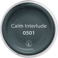
quiet time
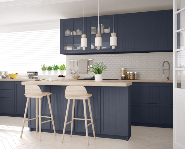
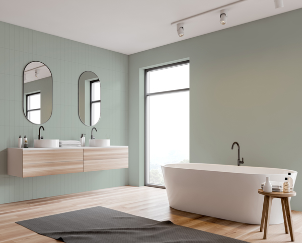
This palette of soft, muted colors offers sanctuary amid our hectic and often complex lives. Blending near whites, blues, and greens with darker neutrals creates spaces that soothe the soul and recharge the mind.
这组柔和,略显暗淡的调色方案为我们忙碌而复杂的生活提供了庇护所。将近白色,蓝色和绿色与较暗的中性色混合在一起,创造出可以慰藉心灵和让人恢复精力的空间。
 |
 |
 |
 |
 |
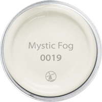
MYSTIC FOG 0019: Calm, relaxed, and peaceful, this soft white pairs perfectly with all colors.
MYSTIC FOG 0019:平静,放松,平和,这种柔软舒缓的白色完美搭配所有颜色。
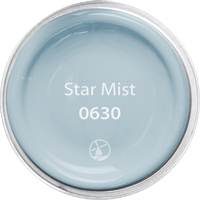
STAR MIST 0630: A harmonious balance between blue and gray, this light and airy hue invites relaxation and new beginnings.
STAR MIST 0630: 一种蓝色和灰色之间和谐平衡的色彩,这种明亮、无拘无束的色调为您带来放松和一个新开始。
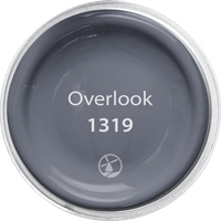
OVERLOOK 1319: Larger than life, an ultra-deep gray-violet shade perfect for grounding light pastels or accenting brighter colors. A striking and modern accent that pairs well with most colors, giving it universal appeal.
OVERLOOK 1319: 一种超深的灰暗紫色调,非常适合作为彩色粉笔墙或用来突出较为明亮的颜色。它是一种醒目和现代的背景色,与大多数颜色搭配得当,使其具有广泛吸引力。
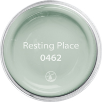
RESTING PLACE 0462: A soft mint described as ‘nostalgia meets clean and simple’. A mid-century hue that is calming and balanced, providing a restful retreat.
RESTING PLACE 0462: 一种柔和的薄荷色被喻为“干净和简约的怀旧集”。这是一种本世纪中期的色彩,是一种宁静和平衡的色调,为您提供宁静的下榻之所。
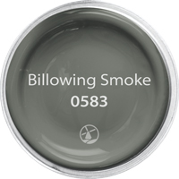
BILLOWING SMOKE 0583: A dramatic deep green with a gritty yet nuanced personality, enabling it to pair with ethereal colors, creating unique and confident combinations.
BILLOWING SMOKE 0583: 一种引人注目的深绿色,有着坚韧但又细致入微的个性,使它能与虚幻的色彩搭配,创造出独特而自信的组合。
 |
 |
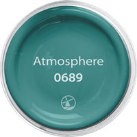
pathway
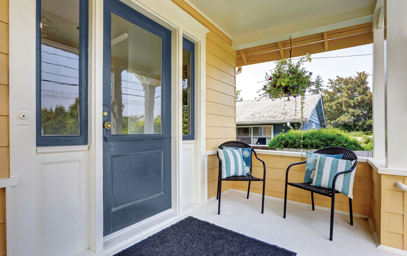
As we navigate our busy lives, we are confronted with the challenges of how to manage distractions, assess information, and stay centered amid the noise of our modern world. To help us determine and prioritize what is most important, or which pathways to follow, we search both consciously and subconsciously for those elements and cues that add value, passion, and meaning to it all.
在我们忙碌的生活中,我们面临着如何管理干扰,评估信息,并在喧嚣的现代世界中保持精神集中的挑战。为了帮助我们确定最重要的是什么,或者遵循什么样的路途,我们会有意识地和潜意识地寻找那些能给这一切增加价值、激情和意义的元素和线索。
|
|
|
|
|
|
|
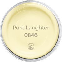
homespun
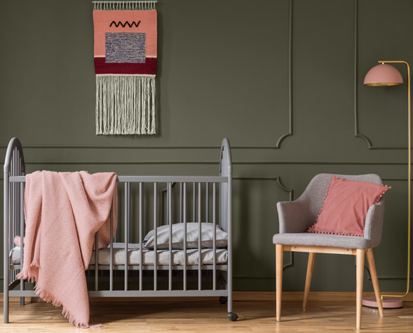
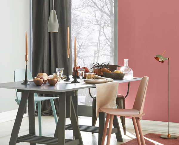
Unique and personal spaces are the inspiration for this palette of eclectic hues that tie styles and passions together. An authentic home is a combination of old and new. Curating family keepsakes, travel treasures, and exciting new pieces can make defining your own style a challenge. Color comes to the rescue with its power to tie disparate elements together into one cohesive design. New and vintage coexist in today’s uncompromising bespoke attitude, with the mixing and matching of styles coalescing to create a look that is uniquely yours.
个性独特的空间是这种折衷色调的灵感来源,这些色调将个性风格和激情联系在一起。一个真正的家是新旧结合的产物。整理家庭纪念品、旅游纪念品和令人兴奋的新物品会让定义自己的风格成为一项挑战。颜色拯救了我们,它将不同的元素结合在一起,形成一个有凝聚力的设计。新旧并存在今天是种不容妥协的定制态度,把风格混搭在一起,创造一个独特的外观。
 |
 |
 |
 |
 |
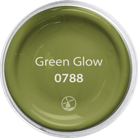
GREEN GLOW 0788: Green Glow sprouts with lush and vibrant renewal. Deep yellow-based greens pair beautifully with yellow, oranges, reds, and even cool gray.
GREEN GLOW 0788:Green Glow(色彩名)代表着郁郁葱葱,生机勃勃。这种深黄绿色调与黄色,橙色,红色甚至冷灰色完美搭配。
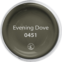
EVENING DOVE 0451: Like the approach of evening’s last light, this ultra-deep brown offers a sense of restful comfort and solace. Pairs well with toned orange, peach, pink, and soft yellow.
EVENING DOVE 0451:就像傍晚的最后一缕阳光,这种超深棕色给人一种宁静舒适的感觉。适合搭配橙色、桃色、粉色和柔和的黄色。
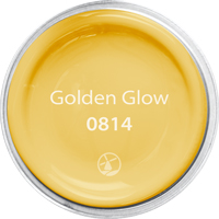
GOLDEN GLOW 0814: An impact color that challenges us to take notice. Pairs well with strong accents like bright teal, red, and orange, or can be a stand-alone with black and white for a sophisticated flair.
GOLDEN GLOW 0814:一种能引起我们注意的具有冲击力的颜色。可以与明亮的青绿色、红色和橙色等鲜明色调完美搭配,或者可以单独搭配黑色和白色,打造精致的风格。
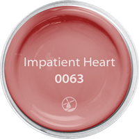
IMPATIENT HEART 0063: A free-spirited peachy-orange offering a fun, fresh, and edgy accent. With roots in vintage mid-century style, this hue pairs well with brown and gray neutrals, greens, and yellows.
IMPATIENT HEART 0063:自由奔放的桃红色,给人一种有趣,清新和前卫的感觉。根植于上世纪中叶的复古风格,这种色调与棕色和灰色中性色,绿色以及黄色搭配得很好。
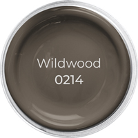
WILDWOOD 0214: Earthy and real, Wildwood emerges from the ground as an accent for both warm and cool colors. Great with brighter colors such as yellow, green, and blue.
WILDWOOD 0214:质朴而真实,Wildwood(色彩名)来源于大地,可用作冷暖色调的背景墙。非常适合搭配明亮的颜色,如黄色、绿色和蓝色。
 |
 |
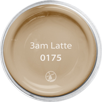
group hug
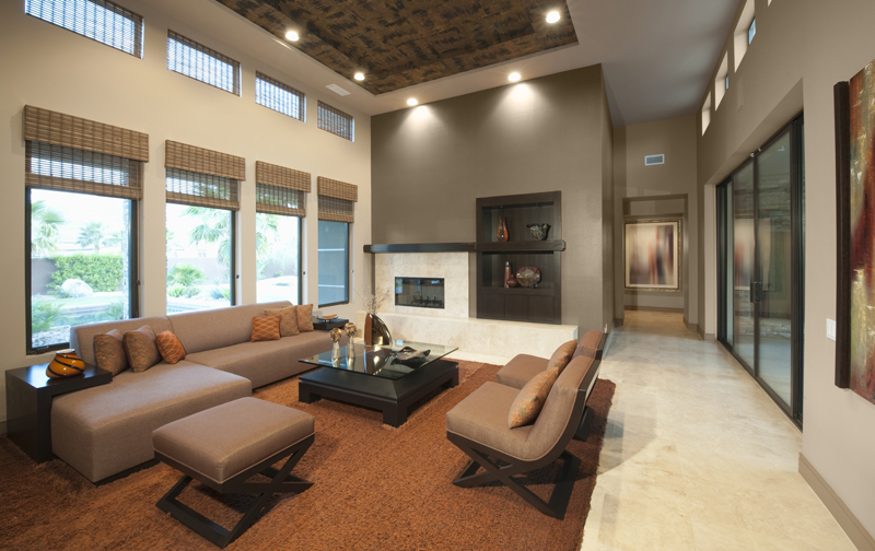
Color has a way of uniting us. Its universal and instinctual appeal helps connect us even if we may not always agree. Group Hug honors our human need to belong, to laugh, and to love. This palette of earth-inspired colors conveys a grounded and secure feel, wrapping us in a reassuring embrace, providing the simple human touch we all desire.
颜色能使我们联结在一起。它的广泛性和本能的吸引力帮助我们相互联系起来,即使我们可能并不总是意见一致。集体的怀抱体现了人类对归属感、欢笑和爱的需求。这种地球色彩的调色方案传达了一种接地气的和安全感,将我们包裹在一个让人放心的怀抱中,提供了我们都渴望的简单的人类接触。
|
|
|
|
|
|
|

